There are a LOT of beautiful fonts available and some are PUA encoded, which means there are additional "glyphs" (other letters or versions of letters) with swooshes and extra twirls on them. As you can see in the image above, I've used these PUA encoded characters in the Matthias Font by Aqeela Studio for the "L", "F" and "S" to make the lettering more interesting than the regular version. The Matthias font is part of the Exclusive Font Collection, which is a collection of 20 calligraphy fonts available FREE from Creative Fabrica for the next 188 days (counting from 6/24/2021), so grab the while it's still FREE.
For Silhouette Studio users, you need to have at least the Designer version (least expensive paid version) to have access to Font management and Glyphs. It's definitely worth the upgrade because of all the additional features that become available when you have the paid version. I have Designer version, but intend to upgrade to Business Edition soon because I can create my own fonts in that version.
Inserting Lettering

Be sure to close Silhouette Studio before you install a new font so that the new font will show up in the list of available fonts in the program.
The toolbar below the main menu provides a compressed font control for changing the font and font size, toggling bold, italic or underline, and setting left/center/right/justified font justification.
The Text Style Panel
Silhouette studio has a Text Style Panel accessible by clicking on the "A" symbol in the right side toolbar. This panel provides more options than the upper tool bar. Let's explore what the Text Style panel can do.The main tab which is visible when the panel first opens list all of your machine's available fonts showing the font name using the font itself to provide a nice visual description of the font. The currently selected font is listed at the top, with the text size to its right.
72 pt (point) is text that is approximately 1" high. Typography geeks can read all about the history of typographic units here (legacy from the 1700s). The size is measured from the top of the tallest ascender (like the top of the letter "d") to the bottom of the lowest descender (like the tail of the letter "p").
Typically, a larger font size is needed to make calligraphy fonts more readable because the extra height of the ascenders and descenders means the x-height (middle bit that's the height of letter "a") shrinks to a very small size.
I usually size the text so I can read it easily in Silhouette Studio, create my phrases then resize the whole block of words & letters to the size needed for my project, using the grid on the mat to ensure it will fit my intended project.
Below the list of fonts, there are other font settings: "B" for Bold, "I" for Italic, and "U" for underline. The next set of four symbols are for text justification - left, center, right or full justify. Most designs use either left or centered justification, but the other two can be used for interesting artistic effects.
The last two icons are text orientation: "normal" or "vertical". The icons illustrate their actions.
The Character spacing section allows adjustments of line and character spacing. Sometimes the standard spacing is too wide or too narrow (in the artist's humble opinion), so these allow the spacing to be adjusted as needed.
In Part 2, I'll talk about the other tabs of the Text Style Panel.
HAPPY CRAFTING!!
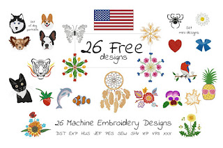
FREE Embroidery Set (limited time)
 You can't beat the price: FREE. If you do machine embroidery or know someone who does, forward the link to them: The Free Gift Set Embroidery Bundle by EmbArt - FREE for next 14 days (as of 6/24/2021)


No comments:
Post a Comment