Tuesday, June 29, 2021

Fonts for Crafting: Adjusting Text PART 2


This is the second part of my mini-series on Fonts for Crafting. If you haven't read Part 1, you may wish to read it now - I'll wait.

Welcome back. Ready to hear more about the fun things Silhouette Studio can do with fonts? 

Cool Font Fun is worth repeating


The image above illustrates how glyphs can change the whole look of a message. This was written using the "Michelle Stein Script" font from the "Exclusive Font Collection Bundle" which is FREE now through 30 December 2021. Click on the image to expand it to a larger size. The words on the left are the "normal" letters, and the ones on the right take advantage of several "glyphs" - notice how the "oo" in "Cool" looks a little different because it's a glyph of two "o" characters (and the first one is a wee bit smaller than the second one); the "l", "t" and "n" in the one on the right all have swooshes following the letter, and the "f" has a heart swoosh coming off its top. 


If you are running Silhouette Studio Designer edition or higher, the glyphs are accessible from "glyph" tab of the text style panel. The "glyph" tab is that "G" visible at the top of the text style panel. This panel lists the font name at the top, followed by a full listing of all the characters or glyphs available in the font. Hover over a glyph with the mouse to see an enlarged view of the glyph. 

To use glyphs, first create your text by typing in the words you want in your design. Next, scroll through the glyphs to find a glyph to substitute for a letter. Select the letter you want to replace or delete the letter then click on the glyph and the new glyph will appear in its place. 

Depending upon the size of the glyph, the text box may resize, so plan on resizing and possibly rearranging the text after selecting the glyphs to use as their presence may affect the sizing and spacing of your text design. 

One other item of note: although Silhouette Studio has a spelling checker, as soon as glyphs are added, the spelling checker will think the word is misspelled even though it contains what looks like the same letters. This is because the spelling checker has combinations of specific characters stored in it, and the glyphs are not part of that set of characters. Therefore it thinks the words are not spelled correctly. That being said, it is possible that the wrong glyph was chosen and that the word is truly misspelled, so be sure to double check the content before sending your design to be cut. 

What If I Only Have Silhouette Studio Basic Edition?

Are you out of luck? 

Thankfully, no, you aren't. 

There are several options available which will allow you to create similar designs with cool fonts without having to pony up the cash for the Designer or higher editions (though there are so many additional things you can do with the upgraded versions that you really should consider upgrading as soon as you can). 

 OPTION 1: Font Cloud by Creative Fabrica

Font Cloud is a FREE tool for managing fonts. Simply sign up for it, upload your fonts (either by drag and drop, or browse for them on your machine), and it's ready.


When Font Cloud first opens, it shows a list of all fonts that have been uploaded, illustrating the font's style in the box with the "Aa" characters.  Simply enter some text in the box where it says "Preview fonts with your own text"


Now, scroll through all the fonts and observe the results: the text you typed is visible on the font card and written in the font shown. Click on the card to select a particular font. This time, I'll select "Mezilla", another font from the Exclusive Font Collection Bundle (free through 30 Dec 2021).


Once a font is selected, the screen displays all glyphs available in the font. There are adjustment controls available to change the size of the letters, and a button to download the font, allowing users to easily move fonts from one machine to another - handy if there's a particular font that would work just as well in a Power Point for work as it would for personal designs. 

To change to a different glyph, select one of the plain letters in your phrase. Click on the desired glyph, then paste (use the keystroke ctrl-v, which means hold the ctrl key and hit the letter "v", OR right-click and select "Paste"). 

As new glyphs are selected, the originally typed words will look odd because the glyphs are not available in that font. The preview below the area for typing will illustrate how the final selection will turn out. Once you've settled upon a design, select the typed in characters and copy ( ctrl-c or right-click on the selection and choose "Copy"). 

Return to Silhouette Studio, select the text tool, choose the font you used in Font Cloud ("Mezilla" in this example), then paste the text onto the work area.


You can now color and adjust the design as desired before cutting.

 I'm Offline and Using Basic Silhouette Studio

If internet access is an issue, or you simply want to use features local to your computer, Windows has a Character Map built in that can be used to copy individual characters or a group of characters to the Clipboard and the they can be pasted into any program that can display them, including Silhouette Studio. To open Character Map in Windows 10, type "character" in the search box on the task bar and choose Character Map from the results.


Select the desired font, then scroll through the character options to locate and select appropriate glyphs.

The listing of characters can be filtered if you click on Advanced view and change "Group by" to Unicode subrange.


In the Group by box that appears, select "Private Use Characters" to display only the glyphs with swooshes and other fancy twirls. Click on the desired glyph and hit the "Select" button to choose the glyph. Click on "Copy" to copy the set of chosen characters to the clipboard. Paste the text into Silhouette Studio. 

The text is now ready for welding, coloring and cutting as desired. 

HAPPY CRAFTING!


Sunday, June 27, 2021

Singer Spartan - Test Drive


Meet "Leonidas", a restored Singer 192K "Spartan". It's sitting in a sewing table that's meant for a much larger machine, my Sailrite Ultrafeed LS-1, which is much heavier, longer, and wider. Leonidas is actually sitting upon a sewing textbook to boost it up that critical 1" to align the machine base with the table. The 192K "Spartan" is usually called a 3/4 size machine because it's larger than the little Featherweight, but smaller than the full size Singer 201. Don't let its small appearance fool you - the Spartan tips the scales at a stout 25 lbs!

Appropriate to its name, the Spartan is plainer than other Singer models of its day - no gold decals adorn it, nor did it come with a light. The light you see on the machine is a modern LED light that's attached to a magnet so it can be put on any metal machine to more light.


Left side (I forgot to turn off the LED)

Back. 

Right side

Close up of stitch length selector. Note 192K label and "Back Tack"

Top view

Another front view

Close up of drop in bobbin and needle plate.


I really like the needle plate - many of my older Singers have a plain one without any markings. This needle plate is marked in 1/8" increments, both horizontally and vertically away from the needle, ensuring accurate seam allowances for straight sewing and sewing around right angle corners.

The Spartan sews very quietly and makes beautiful stitches. The needle threads from left to right, making it easy for its lefthanded owner to thread it. It doesn't have a case, just the black base which fastens to the bottom of the machine with a single large screw. 

I used this machine for about an hour before its engine started losing power and making a clicking noise. I will have to take it to a machine mechanic to fix as I don't know enough about motors to fix it myself. Hopefully, it can be easily fixed. Otherwise, I may just convert it to a hand crank as I've heard that Spartans can be motorized or hand crank machines. 


Friday, June 25, 2021

Fonts for Crafting: Adjusting Text PART 1


There are a LOT of beautiful fonts available and some are PUA encoded, which means there are additional "glyphs" (other letters or versions of letters) with swooshes and extra twirls on them. As you can see in the image above, I've used these PUA encoded characters in the Matthias Font by Aqeela Studio for the "L", "F" and "S" to make the lettering more interesting than the regular version. The Matthias font is part of the Exclusive Font Collection, which is a collection of 20 calligraphy fonts available FREE from Creative Fabrica for the next 188 days (counting from 6/24/2021), so grab the while it's still FREE. 

For Silhouette Studio users, you need to have at least the Designer version (least expensive paid version) to have access to Font management and Glyphs. It's definitely worth the upgrade because of all the additional features that become available when you have the paid version. I have Designer version, but intend to upgrade to Business Edition soon because I can create my own fonts in that version. 

Inserting Lettering

To work with fonts in Silhouette Studio, click on the text tool in the left side toolbar. It is the "A" symbol about half way down the toolbar. You can then click anywhere on the mat and begin typing. The program defaults to Ariel, but any font installed on your machine can be accessible within Silhouette Studio.

Be sure to close Silhouette Studio before you install a new font so that the new font will show up in the list of available fonts in the program. 

The toolbar below the main menu provides a compressed font control for changing the font and font size, toggling bold, italic or underline, and setting left/center/right/justified font justification.


The Text Style Panel

Silhouette studio has a Text Style Panel accessible by clicking on the "A" symbol in the right side toolbar. This panel provides more options than the upper tool bar. Let's explore what the Text Style panel can do.

The main tab which is visible when the panel first opens list all of your machine's available fonts showing the font name using the font itself to provide a nice visual description of the font. The currently selected font is listed at the top, with the text size to its right. 

72 pt (point) is text that is approximately 1" high. Typography geeks can read all about the history of typographic units here (legacy from the 1700s). The size is measured from the top of the tallest ascender (like the top of the letter "d") to the bottom of the lowest descender (like the tail of the letter "p").  

Typically, a larger font size is needed to make calligraphy fonts more readable because the extra height of the ascenders and descenders means the x-height (middle bit that's the height of letter "a") shrinks to a very small size.

I usually size the text so I can read it easily in Silhouette Studio, create my phrases then resize the whole block of words & letters to the size needed for my project, using the grid on the mat to ensure it will fit my intended project. 

Below the list of fonts, there are other font settings: "B" for Bold, "I" for Italic, and "U" for underline. The next set of four symbols are for text justification - left, center, right or full justify. Most designs use either left or centered justification, but the other two can be used for interesting artistic effects.

The last two icons are text orientation: "normal" or "vertical". The icons illustrate their actions. 

The Character spacing section allows adjustments of line and character spacing. Sometimes the standard spacing is too wide or too narrow (in the artist's humble opinion), so these allow the spacing to be adjusted as needed. 

In Part 2, I'll talk about the other tabs of the Text Style Panel.

HAPPY CRAFTING!!

FREE Embroidery Set (limited time)

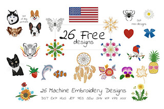
 You can't beat the price: FREE. If you do machine embroidery or know someone who does, forward the link to them: The Free Gift Set Embroidery Bundle by EmbArt - FREE for next 14 days (as of 6/24/2021)

**This post may contain affiliate links. What that means is that I may receive compensation if you purchase through the links I have provided. The price you pay for the product or service is not higher but I may get compensated for sharing.

Monday, June 21, 2021

Antique "Shaw & Clark" Monitor Sewing Machine

 This machine is very pretty - I love the painted details. It was sold as a "Shaw & Clark Paw Foot Sewing Machine", however it doesn't have a serial number or any imprint naming the manufacturer anywhere on it. The style of machine was also sometimes referred to as a "Shaw & Clark Monitor sewing machine". 

According to the ISMACS article on Shaw & Clark, Shaw & Clark and others did not mark their machines with the manufacturer's name because the manufacturers were trying to avoid getting in trouble for patent violations (many of the mechanisms used in the machine were patented by various other sewing machine manufacturers of the time). Later on, around 1864, Shaw & Clark started marking their machines because they were then paying royalties to use the patented features and wanted to be sure that everyone knew that they were paying that money.

You can see photos of machines of this type on AntiqBuyer.com's listing of past sales. The page also shares a bit more of the mysterious history of these machines.  

So if this machine truly was made by Shaw & Clark, that would have its manufacture date somewhere between 1860 and 1864.  If it's not a Shaw & Clark, it could have been made as late as the early 1870s. It's really hard to tell because there aren't any markings to nail down the truth. This machine was restored by an artist who attempted to reproduce the original designs that it would have had when it was first created (that's why it doesn't look all rusty - everything was restored by someone who loves these old machines). 


Front view


An unusual feature of this machine is that it does not have any feed dogs. The needle plate on the bed of the machine has grooves in it for traction, but the ridges are stationary. Instead, the foot lifts up and moves forward, then drags the material back before lifting up again. It's a chain-stitch machine, as you can see from the underneath view where there's a hook. It has a white knobbed hand crank which drives a pair of gears providing more movement of the needle and walking foot per turn. 


Back view


Left side view


Bottom showing hook on left and vertical shaft on right


The hook that forms the chain stitch


Top view 

Close up of mechanism that moves the foot

It is also interesting to note that this was made before standards for screws were established. If you take apart the machine, each screw fits into only one specific hole because they were made individually by the machinist who wasn't consistent about how the thread pitch was set. If any part on this breaks, a replacement would have to be custom made to fit. Of course, another reason for needing the custom replacement part is that the company that made this machine no longer exists.


All in all, it's an neat relic of the 19th century.


Sunday, June 20, 2021

Father's Day "Dad" Card


Now that my Dad has received his Father's day card, I can blog about creating the card. 

I decided that I should learn how to use the pens that came with my Silhouette Cameo 4, and the best way to do that is to have a project for it. I picked the DAD Word Art SVG cut file by Creative Fabrica Crafts. 

Now, the original file looked like this.

I learned that the Silhouette pens actually follow "cut" lines by default rather than automatically coloring in the shapes. So that is why all my letters look like outlines rather than colored in. I actually wound up coloring in the hearts after the machine finished drawing because I hadn't yet determined how to tell the Cameo to color things in properly. That will have to be reserved for another project.
I had some minor issues with the pens skipping here and there, and also with pen drag lines, especially on the back of the card. It also looks like someone - probably me - touched it when the ink was still damp as it's smeared a bit at the top. No matter, Dad liked the card anyway. 

I have since learned - from reading on other sites - that the trick to avoiding the drag lines is to support the mat so that it doesn't bend, causing the cardstock to unstick near the upper edge. Next time I create something with the pens, I'll be sure to put down a few books or magazines under the mat to function as an extension table to hold the mat out flat. 

Now, the inside of the card is interesting because I wound up printing it to another piece of paper and then gluing the paper onto the card. 

Why?

Well, someone (me) forgot to adjust the size of the design area, so the first printout of this design was way down on the page and would have printed off the sheet if I hadn't stopped it. 


I edited the original design slightly by removing the moustache because my father has never had a moustache. The design is the free "Happy Father's Day" design by T-shirtworld, available on the Creative Fabrica site.
I set up the design to fill in the words using cross-hatching. I think I spaced it out too much. I haven't yet figured out how to get the pens to do a solid fill so it looks like I still have a lot to learn, and will have to do more pen projects in the future to really master how this works.

Stay tuned for future crafting adventures. 

Saturday, June 19, 2021

First Heat Transfer Project: Awesome Aunt Shirt


 I'm fairly new to using a cutting machine - I bought my Silhouette Cameo in April 2021 - and since my niece was planning to visit me soon, I thought it would be neat to have a shirt labeling me as an awesome aunt. Awesome aunts do crafting with their nieces, of course, and I planned to help her make some things using the Cameo. 

For the shirt, I decided to use one of my old but rarely worn t-shirts just in case my first use of heat transfer vinyl (HTV) was a disaster and it had to be discarded. After searching around, I found a "This is what an awesome aunt looks like" design on Creative Fabrica in their print templates category


I was happy to see that it was not only a free design, but it also came with a commercial license. Most other design houses mark their free designs as "personal use only", which means you can't use those designs for items you sell. All of Creative Fabrica's free designs come with a commercial license, which is fantastic and extremely generous. They also offer more free designs than most sites - over 25,000 free designs including fonts, SVGs, graphics and machine embroidery files are available in their freebies section. Creative Fabrica also has "daily gifts" which are selected premium fonts, crafts, and graphics designs available free for one day only.

The "This is what an awesome aunt looks like" design came in 6 formats: AI, SVG, DXF, EPS, PNG, and PDF. I have Silhouette Studio Designer edition so I chose to use the SVG instead of the DXF because I read that SVG is supposed to be the best non-.studio3 file format available. I made one small edit to the file, removing the extra space between the k & s in "looks". I also resized the design so it would fit on my 12" x 7.5" piece of HTV.  I then connected my machine and prepared to send the file.

My Cameo came bundled with a collection of vinyl including 9 sheets of HTV. I selected the silvery gray because it looked like it would stand out well on the dark green shirt. After rechecking the documentation on determining which side of the HTV to cut (dull side up because shiny side is the carrier sheet), I placed the HTV on the mat and loaded it in the machine. 

When I hit "send", Silhouette Studio asked me if I remembered to mirror the design? 

I looked back at the design and realized I had forgotten to reverse the design. I mentally thanked the creator of that error message - I'm sure many have forgotten to flip designs and ruined numerous sheets of expensive HTV in the process. I canceled the job, returned to editing mode, mirrored the design, and switched back to the send screen to send it to the machine. The design cut out smoothly and relatively quickly.  

After weeding the design, I stuck it to the shirt and checked the design placement by pinning the shirt's shoulders to my dressform. 
I decided to move the design up closer to the neckline because my initial placement put the hands pointing right at my bust (not a good look). The higher placement looked much better, so I put the shirt on my ironing board and ironed the HTV. I found I had to press certain sections again because the HTV was pulling up when I tried to remove the backing. I think that would happen with any HTV design when using a regular household iron. I have a heat press on my wish list so I can do more HTV designs with less struggle. 

I wore the shirt the day my niece visited. She noticed it after we had been talking for about an hour. 

I have washed the shirt once and noticed that couple of letters are starting to peel up on the edges. The good news is that was easily fixed by ironing the shirt inside out. Of course, if I had that heat press, it would have stayed on better. 

I think I'm going to have a lot of fun decorating other garments with HTV. I have already ordered more HTV in a variety of colors.


HAPPY CRAFTING!


**This post may contain affiliate links. What that means is that I may receive compensation if you purchase through the links I have provided. The price you pay for the product or service is not higher but I may get compensated for sharing.

A Tale of Two Singer 15s : 1921 vs 1953. What Changed? What Stayed the Same?

 In my last post, I introduced my "newest" (yet oldest) Singer 15 ~ a Singer 15 manufactured in 1921 .  This wasn't my first S...